
The upper midwest’s lifespans are extended because of the need to go into hibernation, so the number of active days is closer to the lower latitudes. Casseroles were created to allow them to fatten up for winter, as there are not enough salmon for the general population.
The numbers should come down with global warming letting them forage during the winter months.
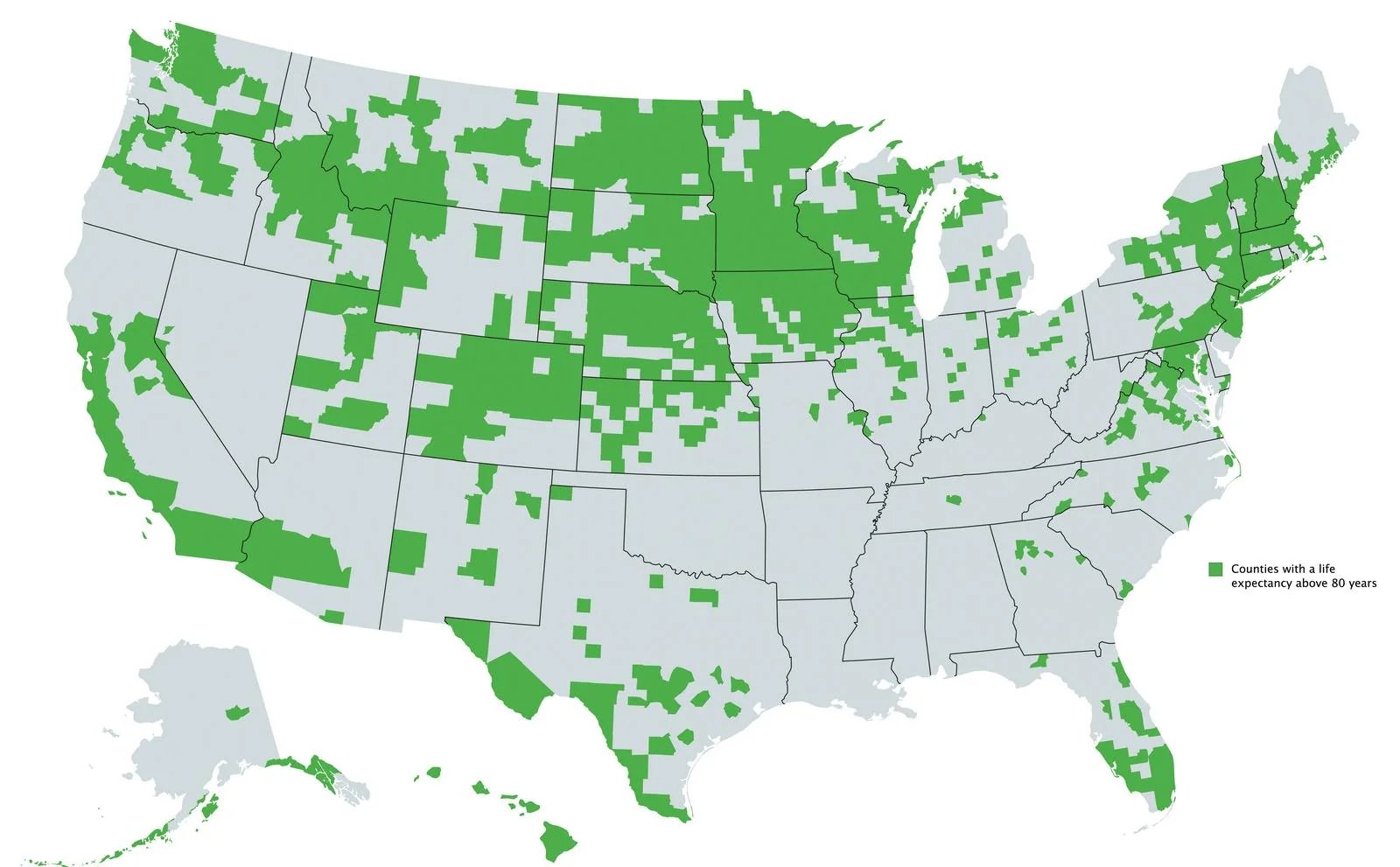
Basically nowhere in the south except parts of Florida and Texas huh
people that made it past retirement age moving to South Florida could skew the data curve
Phoenix, too.
I saw an explanation that this is effectively mapping White and Latino populations.
Which also led me to learn about the Hispanic Health Paradox, which was a very interesting read.
And liberal big cities, like Atlanta.
What’s weird is seeing this include Austin(Travis county - part of that blob in the middle of Texas), but San Antonio, Houston and Dallas are missing. It looks like the counties north and south of Harris(Houston) make the cut, but not Harris county itself. All of those cities are big liberal cities in Texas.
Harris County’s air and water are notoriously polluted with carcinogens from the nearby fossil fuel and plastics plants. There’s a reason the U.S.'s most advanced cancer research center is in Houston.
Similarly, affluent white suburbs of Atlanta are included, but Fulton County itself (where most of the actual city is) and the poor black suburb of Clayton County are missing. I wonder what the difference could be?
Miami: Heaven’s Waiting Room
I bet this lines up extremely well with a map of where the population is oldest.
Like retirees moving to Florida? Survivorship bias is map form?
Yep, the older you are the higher your expected life span.
It’s basically where people exercise more and/or have an outdoors-y culture.
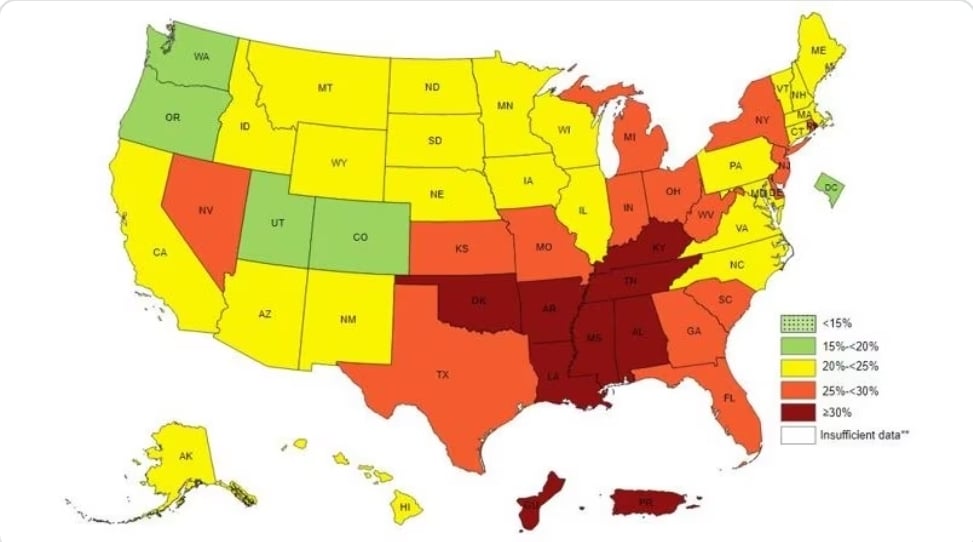
Levels of sedentary lifestyle by state:
If that map was more granular, I bet it would match very closely.
Lazy ass Rhode Islanders.
It’s hysterical because the conservatives in the South are always saying how those pansy liberals wouldn’t know a hard day’s work if it hit them in the head. And here you have evidence that many of those states are among the worst and the rest are orange.
The hardest working states are the ones right down the middle, from North Dakota to Texas. The least hardworking are generally the northeast (excepting the redder states of NH and ME) and west coast.
Somewhat unsurprising if you realize that most of the states down the middle have some of the lowest unemployment rates in the nation–e.g., North Dakota has an unemployment rate under 2%, whereas states like California, Washington, and New York have some of the highest.
Hardest working also factors in rates of overtime or multiple jobs (i.e., average hours worked per week), so realistically you want to be somewhere like Mass or Vermont (and others) that have both low unemployment and reasonable weekly hours.
That makes those states less “hardworking,” but I would bet the standard of living/happiness indices are higher in those states. Regardless, by these metrics and in general, red states do work more hours and have more of their state’s people gainfully employed.

Thanks for this info! I really appreciate learning more.
I think you have that backward. The red is showing the higher percentage of people who exercise. Which if the case, states around Mississippi exercises the most, while those in Washington and Oregon exercise least. This could suggest those those in warmer climates exercise more.
The first map shows life expectation over 80+, I believe to correlate more with affluence. Basically the more money you have, the higher the chance of living longer
No, it’s a map of what percent say they don’t exercise at all. I should have included the legend and title, but I’ve corrected the verbiage in the original post.
Are you of the opinion that north dakota, south dakota, Vermont, New Hampshire, etc are filled with wealthy people? I know you want to hate rich people, which is great, but that doesn’t seem to be the whole story here.
No, it’s a map of what percent say they don’t exercise at all. I should have included the legend and title, but I’ve corrected the verbiage in the original post.
Well, yeah ok. It’s understandable now that you fixed the wording. Why would I hate rich people? Why are you making such an assumption? It’s absolutely wrong anyway.
So basically all of them except for the deep south?
With a lil pocket around the big (relatively) liberal cities
And Nevada! God bless those slot jockeys!
We could just swap that green for blue.
Not really, at least looking at some of Ohio. Cincy seems to be missing, and I’m not sure which county that is in SE Ohio near the WV border.
Nah, I’m thinking it’s probably correlated with wealth. I see a lot of red areas covered on this map
But your map contradicts what you’re saying??
how many lived their whole life there. I suspect some places are retirement spots.
Thought maybe this tracked with states that did not expand Medicaid yet, at least in the Southeast, but nope. Arkansas and Louisiana both expanded Medicaid. Heck, Wisconsin hasn’t and it’s mostly green.
Southern food isn’t very healthy.
Yeah I would love to believe this is anything other than a map of high ratios of white/Asian to other races, which itself is a proxy for high socioeconomic status ratios.
Plenty of white people in the south, yet entire states like Mississippi and Alabama have nothing.
And Asians constitute like 5% of the population, and skewed heavily to a handful of big cities. No way all of the north Midwest is that Asian
It’s obviously different in different areas. The Asian was more referring to the west coast. In the south it would be primarily wealthier cities, and the only of those that exist in the south (like Atlanta) are shown here.
Ohio is entirely clustered around its major cities, so… water = wet???
What’s going on near the WV border? I’m not sure what city that would be. Looking at a map, maybe it’s Noble County? Google says it has a population of around 11k people (4th least population).
Why the arbitrary 80 year line? Why not show all the data with a gradient?

