- cross-posted to:
- movies@lemmy.world
- cross-posted to:
- movies@lemmy.world
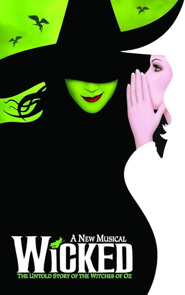
Fans customized the Wicked movie poster to more closely match the original Broadway poster.
Original Broadway Poster:

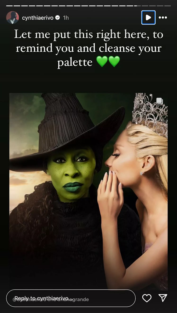
Movie poster:

Some fans, disappointed by the poster, altered it to be closer to the original, moving Grande’s hand and lowering the brim of Erivo’s hat to cover her eyes. The edits prompted Erivo to respond. “This is the wildest, most offensive thing I have seen
“None of this is funny. None of it is cute. It degrades me. It degrades us,” Erivo continued. “The original poster is an ILLUSTRATION. I am a real life human being, who chose to look right down the barrel of the camera to you, the viewer… because, without words we communicate with our eyes.”
So, this seems like a completely reasonable reaction to fans making fan content.


ooh good question.
she has a very deliberate stare and a relaxed face, so it looks like she’s hearing something she doesn’t like that concerns her and she’s deciding what to do about it.
I also see something vulnerable in there, since the muscles around her eyes aren’t very tense, but still a very earnest look.
hoping for understanding, with a little resignation to do what must be done.
she’s nailing it with respect to her role, now that you bring it up.
you described almost every “resting face”.
I thought the resting face was supposed to be aggressive or bitchy?
she doesn’t really have those qualities in this expression.
no, that’s called a “resting bitch face”, not “resting face”
Resting *Witch Face
got it, I’m way out of common buzzword territory at this point.
buzzword or not, that is the expression all of us make when we’re not making an expression. Eyes open, not tense, not smiling for no reason.
that is definitely not my resting face.
or most resting faces I’m familiar with.
you think Cynthia has a resting face in that official poster?
with that deliberate a stare and her eyes that wide open? The corner smile and eyebrow?
That’s super weird from over here, but everyone sees something different, like with everything else.
no bigs.
what smile???
The small smile on her face I assume is a direct homage to the smile from the animated poster.
slight uptick in one corner of the mouth.
did any of you actually look at the official artwork poster with Cynthia on it?
various statements about her face are divorced from reality.
animated smile, camera right slightly raised corner of the mouth:
cynthia’s smile, camera right slightly raised corner of the mouth: