• 0 Posts
  • 767 Comments
Joined 7 months ago
cake
Cake day: February 18th, 2024

help-circle

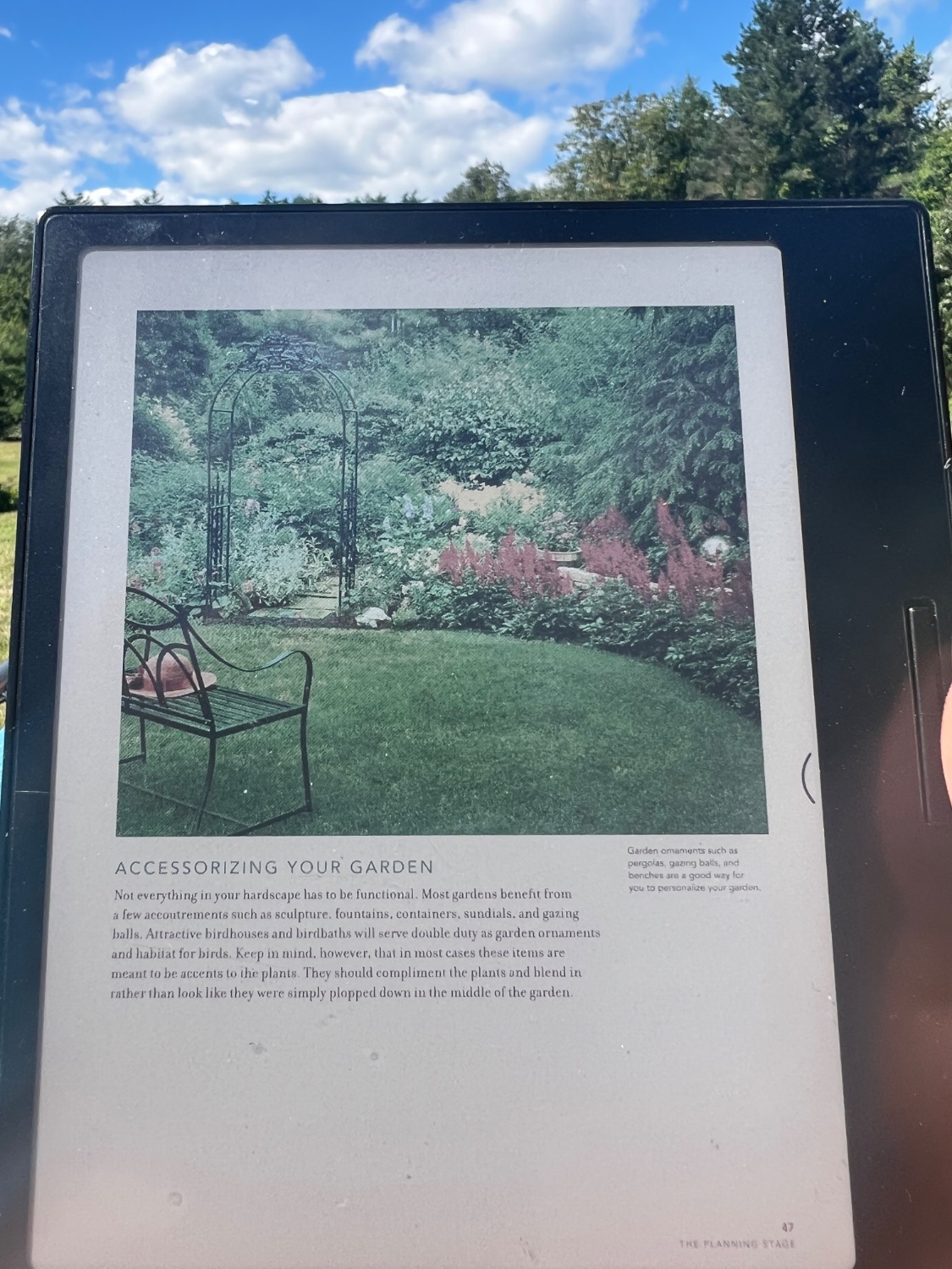
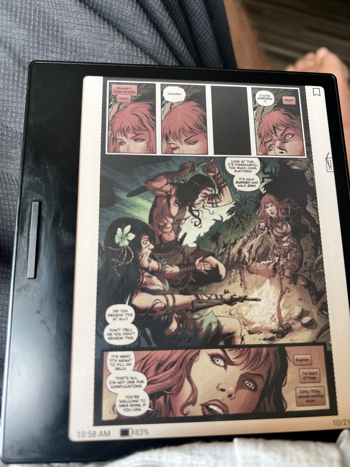
  • I’m not trying to say there’s anything wrong with showing your experience; I’m just showing mine for comparison. I do turn the front light up extra for color, but personally I think it adds a lot.

    The go color 7 is also boox. Outside of setting apps to regal mode I haven’t really tuned anything. Regal seems to also help with both color and b/w contrast, but it’s persistent and doesn’t need to be changed repeatedly.

  • It’s a collection of games you pick from a menu. The premise is that they’re all from the same studio back then, but they’re mostly standalone.

    I’ve only tried a couple so far (the first couple) and they feel pretty basic. I guess if the theory is that they’re progression in their development over time the more compelling stuff would be later? Regardless, I wasn’t expecting 50 masterpieces, and they’ve made a point of communicating that they won’t all be huge and heavily featured.

    I’d definitely be interested in suggestions of ones that stand out though.

    Edit: Mortol is the first one I can really see spending some time trying to master. It’s a platformer where you have finite lives and need to kill yourself one of three ways to make a path forward for the next guy. I’m going on to new ones for now, but I like it.


  • I think his picture is probably in lower light, without turning the front light up to compensate. The color really needs light to look good, and it takes more than the black and white does. It might also be something with the color formats his example is using. I don’t think it’s differences in the screen unless his is defective, because I think his is using the same screen tech. (I’ve thought about getting the tab ultra c, but I’ll just feel like I wasted my money when they finally manage a 13"). I think the pictures are pretty representative of my experience, but it’s also possible the processing my iPhone is doing plays a role. It’s why I try to leave a little background in for comparison.

    Because a crappy phone camera makes it look like the black and white isn’t great, I’ve taken pictures of that in the past too, including a close up of the text:

    Black and white


  • What device you use is one of the biggest data points advertisers and trackers use to fingerprint you across the internet. No, “I use a Google Pixel 9” does not, by itself, de-anonymize you, but it does make a big dent when combined with other information.

    You keep talking about “proving the authenticity of an image” with something that does not even move you .00000001% towards an image being legitimate. It is literally zero information about that question in every possible context. It is, eventually, if you throw out every camera on the planet and use heavy cryptography, theoretically possible to eventually, in the future, provide some evidence that some future picture came from some specific camera, but it will still not be proof that what that camera processed wasn’t manipulated.


  • No, you cannot use metadata as even extremely weak evidence that an image is real. It is less than trivial to fake, and the second anyone even hints at making it a standard approach, it will be on every photo anyone uses to mislead anyone.

    Most photos on the internet are camera phones, and you absolutely are not entitled to know what phone someone has. Knowing someone’s phone has infinitely more value to fingerprinting a user than including metadata could ever theoretically have to demonstrate whether a photo is legitimate or not.

    Photos without a specific, on record provenance from a credible source are no longer useful for evidence of anything. You cannot go back from that.


  • I primarily use it for books, but not all fiction. Color highlighting, diagrams and graphics, and syntax highlighting of code all add a lot. Visualization of data is also enhanced a lot by color. And while I’m not a huge comic book reader, some of them look really good in nice lighting on the go color.

    I think PPI is a big part of the reason there aren’t good 13" color options yet. Color is half resolution and 100 isn’t worth it.