Took a painting class at the local art museum today and painted one of my first acrylics. I was really tight on time and finished this in less than 1 hour. Still happy with it tho. If I had more time, I’d work a lot more on shading the water, adding some foam in the wind, and making the trees more blurry pixelated like Monets. I might go get some acrylic paint and finish it up.
I’d love some feedback or guidance.
I am no expert, but I think you’re on the right track. I love the way the grass on the dune looks.
I also think you’re right on about the weak points; shading on the water would be really helpful (right now, it looks like a flat plane; adding some shading could give it some depth), giving the wind more motion would make it much more evocative, and the trees look pretty sparse; an impression that could be helped greatly by making them look more impressionistic (the style you’re talking about is called “pointillism,” by the way).
Also, I love the texture and color you gave the sky, but in my experience the sky by the sea tends to gave a gradient of brightness, depending on where the sun is. Same with a dune. Giving both some more shading would add a lot of atmosphere.
Good work, and good luck!
Have you ever tried watercolour?
And here I were thinking I’d advice testing oil painting :-D Water soluble oil is fantastic btw.
Impressionists used oil, were there any who used water colors?
I remember seing one that was partially watercolour but thats it.
yes, actually!


I am currently learning the effects of water color paint vs acrylic.
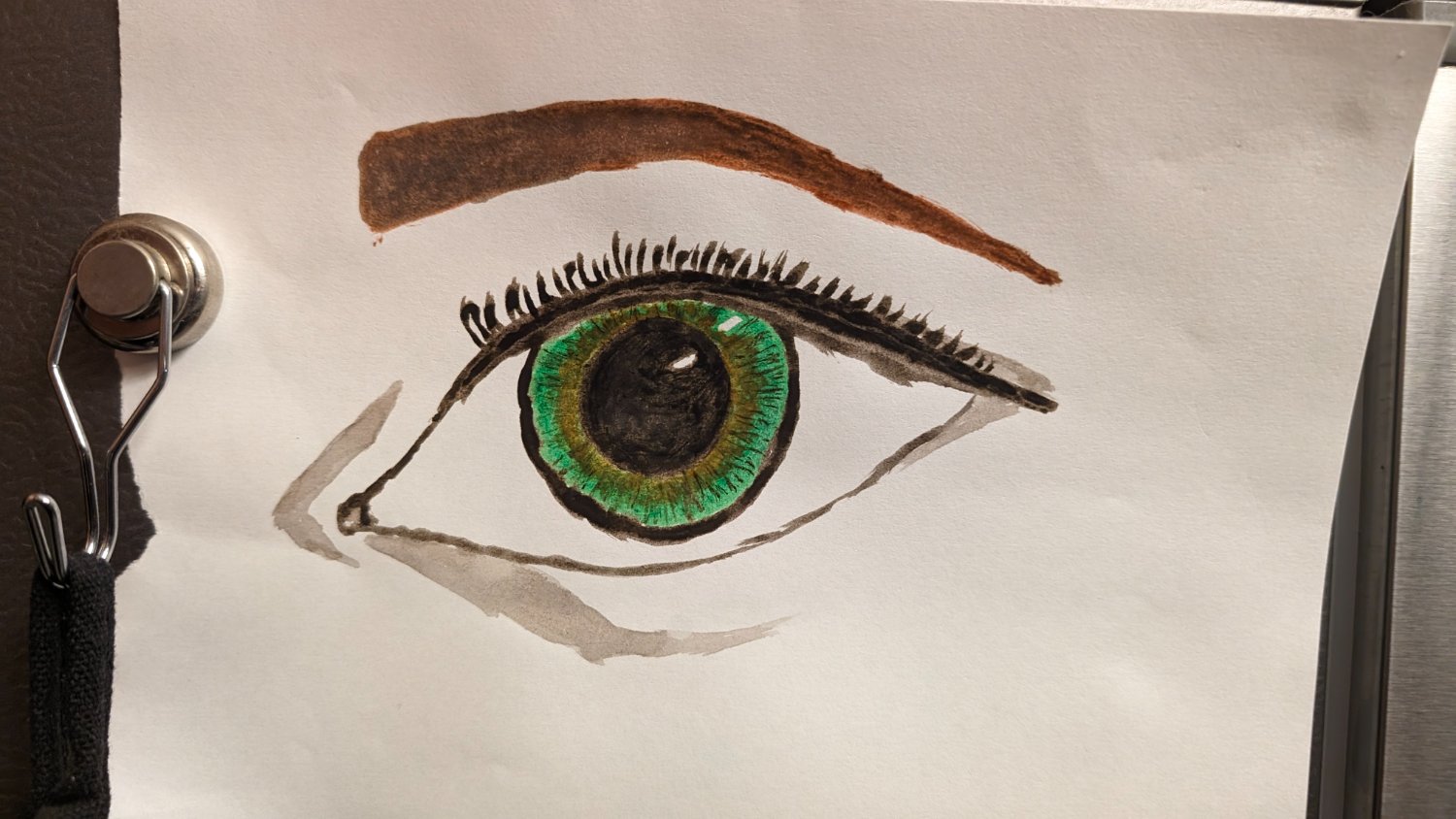
I like the blending you were able to get with the eye.
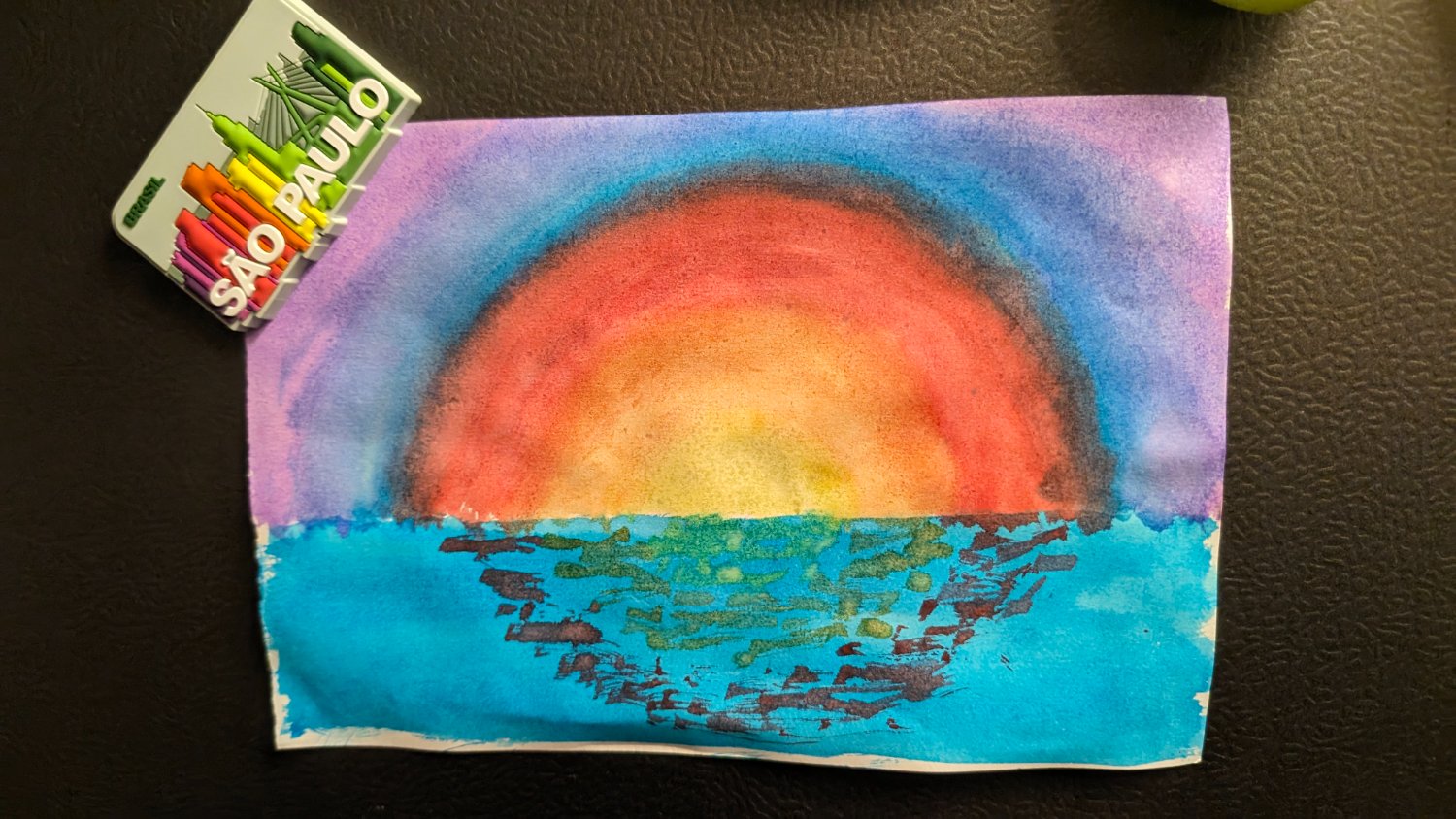
nice! I like how you are using shading in this one to represent depth
Well, I dig your bullshit cause I feel like I would see this at a local thrift store when I lived on a certain island we all know and love =)~!! And by that I don’t mean any kind of insult. By that I mean something like this -> artist was trying their hand on something. Had too many canvases hanging around -> offloaded some of their work to the local thrift store for local aunties to add some panache to their homes with. So I like it, and I would for sure hang this somewhere to stare at comfily in my home =)!
So I guess I like whatever bullshit you’re putting down =)!
thank you! get ready then. there’s more of where that came from 👉😉👉
Bring it <3~~~ Hahahaha!
If I may nitpick, the balance of the image, between sea, sky and land is currently a bit dominated by the former two. A bit bigger land mass would make the picture more appealing.
Very nice job, though, keep it on!
Thanks! I agree with your critique. The intention was to place more effort on detailing the water, but I had run out of time. I ordered a paint set that should be here tomorrow, so I might work on it this weekend and will repost 👍
Good luck!


