From the article:
The man is blaming the automaker even though the manual door opener was under his left hand the whole time.
A man in Arizona says that he was recently trapped in his Tesla after getting in, closing the door, and then realizing that his battery was dead. What he didn’t know is that the manual release for the door was under his left hand the whole time. Now, he’s blaming the automaker and raising awareness.
Rick Meggison, 73, says that Tesla needs to address what he calls a “safety concern” involving how to exit the car when the battery dies. The main door latch actuator on all Tesla models is electronic so if the 12-volt battery dies it won’t work. To ensure safe exit of the vehicle Tesla includes a manual release. Meggison didn’t know about that and ended up trapped in his car for 20 minutes on a hot day.
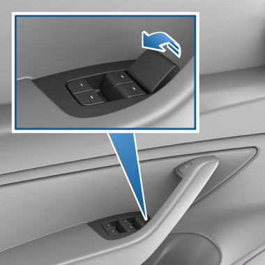
“I couldn’t open the doors. I couldn’t lower the windows. The computer was dead, so I couldn’t open the glove box. I couldn’t open anything,” he told ABC7. Of course, he could’ve opened the door in about two seconds had he known that the manual release was just ahead of his window switches. His situation has many wondering who’s to blame in situations like this.

this is the most sleekness-over-usability dysfunctional bullshit I’ve seen in a minute, it’s not even labeled
$0.50 has been deposited into your Tesla Supercharger credit account
God damn that’s some shitty execution of a handle. I can see how it would get mistaken as asthetic molding
It’s not meant to be used normally. The button further up is the normal electronic release.
The back one is even worse. You have to pull up the cup holder mat and pry out a clip before you can pull a wire.
Manual release huh. Back in my day we called it a door handle.
Can we quit reinventing shit that works fine already? It’s just marketing anyway.
Could have called 911, provided he had a phone with him. With an active battery.
Not even really relevant to this post but I hate the minimizing trend of car’s interfaces. I’d much rather have an actual handle & volume dials rather than touch screens shoved at you as a cheap way to trick people into thinking a car is more expensive when in reality it has better margins like that.
Touch screens are cheaper to use over actual buttons and dials which is why they are the new standard.
This source keeps pushing tesla propaganda. There’s always an angle trying to sell that it wasn’t the tesla’s fault
Door handles have been perfected since Ogg build a door to his cave. Why do we need to reinvent it?
Do these cars not come with a physical manual?
Might be in the glove box? Accessible via touchscreen only (yes it’s dumb).
Can we stop reinventing the wheel constantly ffs?
Electric windows, electric handbrakes, computers in control of everything and now electric fucking doors?
What’s even the point besides artificially upping the price and selling it as a “luxury product” that can barely function in an emergency?
If a passenger can’t figure out how to safety exit a vehicle, that sounds like a design problem.
Agreed. Manual opening should be visible and easily used by anyone even if you don’t know how Tesla works.
Yeah. This is pretty cut and dry.
Opening a car door from the inside shouldn’t require special knowledge. It shouldn’t require searching.
The manual release inside a trunk is easier to find.
Looking at the image in the article, it looks like a pretty simple latch
Not obvious enough for a safety feature
Controversial opinion, but anyone buying a car which is a giant death machine, should read the manual before driving it, especially when it’s an electric vehicle and things aren’t like normal cars.
Now I dislike Tesla, but the manual release isn’t hard to find.
This might work if the only occupant ever was the owner. But it totally ignores all the passengers and children that will be in the vehicle.
Door handles should be intuitive at this point.
What about passengers or people who rent a Tesla?
Isn’t the manual displayed on the touch screen?
They have a copy on the touch screen and another on their website. I’ve probably read more of the Tesla manual than most Tesla drivers and I don’t even like Tesla.
They don’t provide a printed copy of the manual, it’s only on the computer. This makes it awkward to really read as you have to sit in the car. It also means that if the battery dies you cannot access it to even look up things like the manual door release.
https://www.tesla.com/ownersmanual/model3/en_us/GUID-7A32EC01-A17E-42CC-A15B-2E0A39FD07AB.html
I don’t own a Tesla so I guess it’s impossible for me to read this then.
When someone is panicking, the nonstandard design will really shine.
Especially for seventy year olds, the most reasonable and adaptive kind of human!
Exactly why you should read the manual first.
So imagine for a moment that this is a child and not a senior. You gonna scream at little Timmy for not RTFM?
Car doors have been pretty standard and self explanatory for 100 years, until now. There was no good reason to make such a huge design change for the sake of looking cool, especially when the override is hidden behind a piece of trim.
Exactly. People on here claiming read the manual to find out how to open a door must be missing /s because they sound insane.
Standards exist for a reason and your product should be intuitive or BETTER, a shitty button with a picture is not better than a handle like literally everywhere else.
If there even is a paper manual, it’s probably in the electronically opened glovebox, which obviously won’t open anymore…
Don’t get me wrong, I don’t like the change, I dislike Tesla’s and see no reason for Tesla to change what is standard.
But I still believe a grown adult buying a giant metal death machine should read the manual before driving off in one, especially when if you do just calmly look around for more than 5 seconds you can find the door open latch.
Normally, I’d agree with you, but in a matter of life or death, like baking in a hot car, the means of exit should be obvious for anyone, including children and the elderly. Just like in public buildings with proper exit signage, there should be no questioning how to get the fuck out in an emergency.
Have you read your car’s manual cover to cover?
I hope you’re not responsible for designing products, because intuitive product design is important. Requiring a manual to understand a potentially life-saving feature of your vehicle, because the manufacturer chose form over function… listen to yourself.
Here’s another great solution: don’t let your car battery die (/s)
Yes, I have 2 cars, I’ve read both manuals.
I’m not saying I agree with with the bad for handles, but manuals for a big death machine should be read anyway, and if he did he’d know how to open a door.
I know this is 8 months old, but are you seriously arguing people should read a car’s manual to know how to open the door?
Any door that requires the user to read a manual is a terrible design.
You misunderstand. I’m saying every car owner should read the manual for their car. Buy a new car, read the manual, it contains a lot of useful information whether you drive a crappy Tesla or not.
I’ve even had people almost use it instead of the normal button. “Oh not that one. The button where your thumb is”


