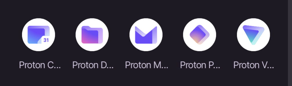
That the labels for the apps get truncated so you can only read “Proton” plus the first letter of the app. I’m only able to distinguish based on the icons which isn’t great because Pass and Drive are similar colors, and Pass and VPN, and Drive and Calendar are similar shapes.
You must log in or register to comment.
The icons can be hard to distinguish, on the fly.
What would you like to use today? The proton square? The proton rhombus? Or the proton triangle?
Yet another reminder of why I love the Niagra launcher so much.
This app may share these data types with third parties
Location, App info and performance, and Device or other IDs
This app may collect these data types
App activity, App info and performance, and Device or other IDs
Why?
Im trying to figure out why the icons all need a white circle behind them.
All of my icons are circles. Are yours not?
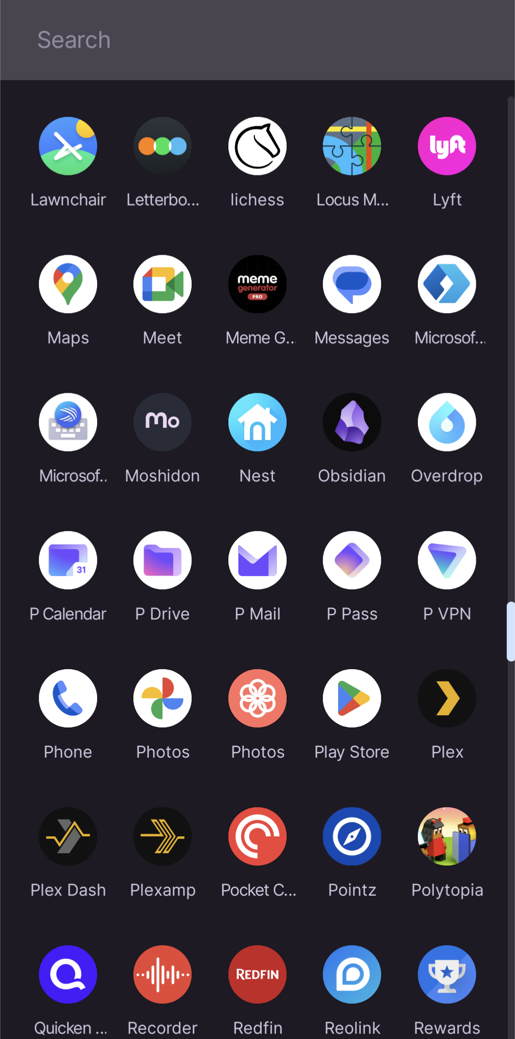
I was just commenting about how it’s half-assed design to just slap an existing icon against a white background and call it a day. Compare to the lawnchair icon, locus, or even the Lyft icon in your screenshot. You find the names annoying, I find the design laziness annoying. Companies do it on iOS as well (including Apple).
